Jul 31 11
What’s Your Take on This?
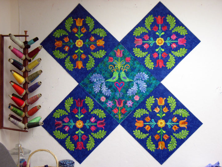
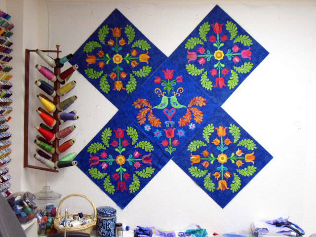
I’m finally at a place where I can make some headway on the trapunto and free motion machine embroidery of the tulip blocks I’ve fused up, and as I’m doing this, I need to figure out which arrangement will make it to the final quilt. Here’s option #1:
(This option has a very different color background fabric in that center block). And here is option #2:
(This second option has a center block with somewhat similar background fabric, but it’s not exactly the same as the other 4 blocks.) Which layout do you like better and why? I know, I know…you’re thinking that you can’t possibly know which one’s better without seeing the fabric for the side setting and corner setting triangles! I haven’t figured that part out yet but as soon as I do, I’ll post some photos with that fabric in place. But until then, what are your thoughts?
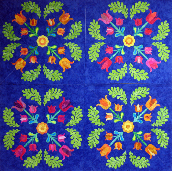
The four outer blocks are red/pink and orange/gold variations of the same layout. The only thing I’ve changed since my original layout is that I’ve added some internal teardrops inside the stem bases:
I’ve loved every minute of playing around with these applique shapes! Here’s another layout that I’m going to use for another quilt sometime in the future:
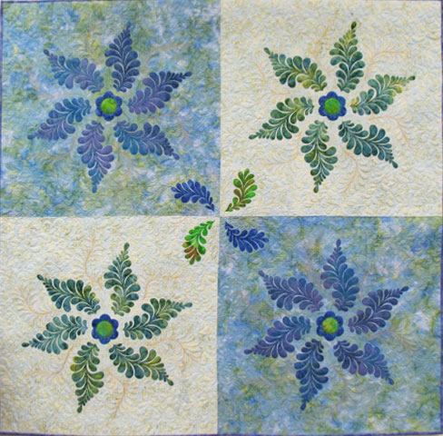
Wow, I think these blocks are a knockout even when they’re set on square! I think if I used lots of them in a quilt, I might add one more shape where all 4 blocks come together. Hmmm, something to ponder, but that quilt’s a long way off as I need to finish this other one first! In the meantime, here is a picture of the completed quilt, “Dancing Feathered Star 2:”
It sure feels good to get a project totally done! Now back to my tulip quilt…


Really so beautiful
Patsy, my pick is Option 1. To me it has more depth, it’s more interesting and lively…love it!!
Hi Patsy: I prefer option 2. I think it causes the eye to stay focused on the whole quilt and gradually move to other areas, rather than the eye darting from a subdued center as in option 1. Also, the color of the blue feathers in option 1 doesn’t appear elsewhere so in my opinion it’s not compatible. That’s my story and I’m stickin’ to it.
I like the second one with the darker feathers. I think the tail feathers just pop the other colors. I also like the quiet of the second background.
Love the bright colors and the tuilips are so much fun….I love it 🙂
Smiles,
Kelly
I like option 1 and would somehow pull that background fabric out into the setting triangles. Not necessarily the background fabric there, but an element of the block. Just my opinion.
well, who am I?…but I like option 1 better. it is a beautiful design no matter which you choose…and i love love love the dancing feathers…wow!
I like option 2 better because I think the fabrics flow together nicely. It really makes the center pop. The grayness of the center recedes on option one. Great job!
Option 1 is my choice. I like the way the birds, and the other appliqued elements jump off of the background fabric in the center block because of the muted background. In the second set, the center block is “in your face”. Of course, both blocks are beautiful. Your completed quilt is lovely. I sure wish your quilting showed up more…you work so hard.
I like #1 also, probably because of the variation of the background color. As you say, the corners will change things, so I’m waiting to see them!
I prefer option 2. Although I love the background fabric in number 1, it looks to busy and some of the design is lost as your eye looks at the pattern and colours of the background and not at the applique design.
I like option # 1…think it’s more of a focal point with the different background fabric….
I really like the first one. The shades in the middle block, really bring out the colors in the other blocks. I think the second dulls them down, but maybe it is the photo.
Debbie
I like option 1 better. The green background stands out better. Option 2 would look better if the blues where the same fabric. Good luck with making a decision. I can’t wait to see the next step.
I am an option one girl. I find it more interesting and just want to spend more time absorbing all the detail. Good luck. Can’t wait to see the finished product.
I’m for #2. Middle block in option 1 seems to disappear leaving the quilt with no focus. Option 2 pops, draws my eyes to the middle and gives a feeling of rightness.
Option #2 is more eye-catching to me. The first option is boring with sameness. All I see is dark blue. The differing fabrics in #2 complement each other and add far more beauty to the overall pattern.
Sorry. I reversed my numbers above. Option #1 is my choice!!
I’m for option #1 because I favor green, and the blue tails stand out very nicely on that fabric. Option 2 will also be nice depending on the corners as you say; both are inspiring
I like # 2. for me it seems to sparkle more
Number 2 is outstanding with the clarity of the vibrant colors popping the whole quilt! Number 1 would have been fine if I hadn’t seen #2. Then u compare the older piece u are trying to pick up with vibrant quilt threads and that just pales in comparison to #2. Guess some people want peaceful, soothing quilts and others the knockouts! #2 is a winner!
Hi Patsy –
I like the second option better. In the first option, there isn’t enough contrast between the appliques and the background in the center block and that leads the block to look a bit washed out to me, especially as compared to the outer blocks. I think the appliques in the second option really pop.
Nancy
I like option 2 the best. The colors of the feathers are real eye catchers.
my preference is for option 1. I like the way the background difference shows but not too much to make you look only at that block
I immediately liked option 1 better. It seems more interesting and leads the eye around more than the the other option. With the 2nd option, the eye takes in the whole quilt at once. In the 1st option the eye is drawn to different areas of the quilt. I guess you could say there is more motion to option 1. So I would definitely go with option 1. This is a beautiful quilt either way however.
I like Option #1—the different background fabric in the middle block makes the 4 outside blocks stand out, It is gorgeous!!!!!
I like ’em both, but I like option #1 best. Why? Who knows! Probably just because I love oceany colors and I’m not at all fond of reds, oranges or yellow, so the blue tail feathers really draw my eye in!