Aug 07 11
Background Fabric Options and a Teaser
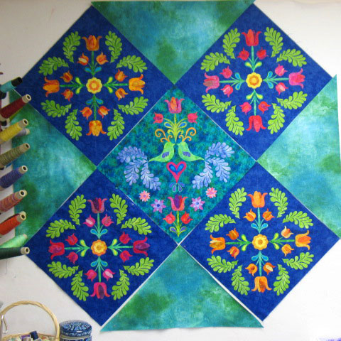
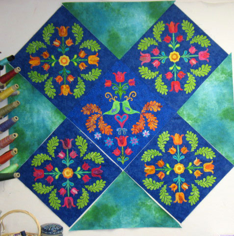
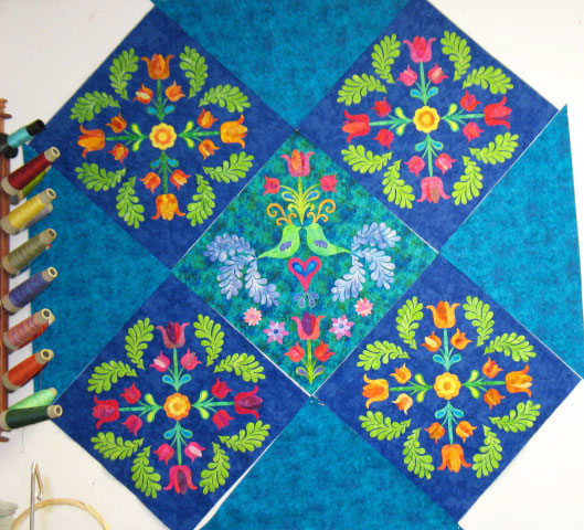
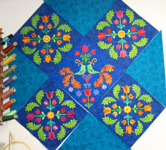
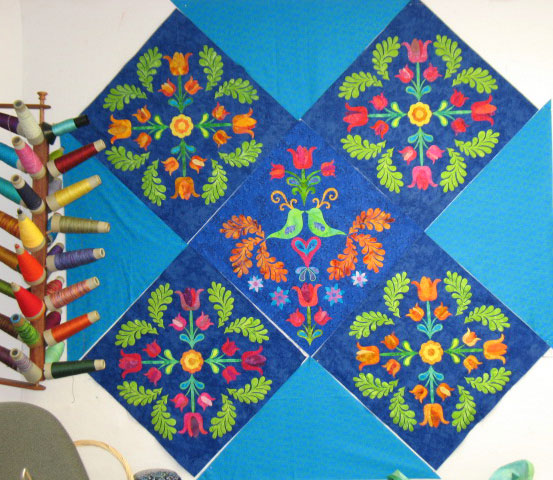
Thank you to everyone who “weighed in” on the 2 options for the center block. Between facebook responses and blog responses, I think folks are split right down the middle on this one! It gets even more confusing when you throw in fabric for the side setting triangles (The corner setting triangles will be the same fabric as the side setting triangles, but it takes nearly 1 yard of fabric just for the side setting triangles and I was afraid to cut up more unless I was 100% committed to a fabric.) Here goes:
See what I mean about confusing? The 3rd fabric is already “out” in my mind. I say that because it’s a very cheapo fabric and I only bought it to see if a lighter turquoisey-blue would work. I’m not any further along in answering that question! My personal leaning is toward options 1A and 1B. That fabric is actually much richer and reads more green than these photos show, so it lends a nice contrast. If someone put a gun to my head and said I had to choose right this very second, I would pick 1B. I say that because I like the contrast in that center block better (I think it’s the orange tail feathers against a dark, dramatic backdrop). The other reason is that after working with these applique blocks for the last few weeks, I have it in my head that this is a blue quilt. When I look at option 1A on my design wall, it strikes me as a green quilt and blue is only a guest at the party. That sounds ridiculous, but I just feel like blue should be king here! Either way, I’m not done auditioning fabrics. I’m halfway done with the trapunto and free motion embroidery of the applique blocks, though, so I need to move this decision forward!
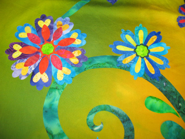
On another note, I’m almost done putting together my next quilt top and it is loaded with color! Rich, riotous color!! Here is a teeny part to whet your appetite:
I promise a blog post with lots of photos on this new one within the next 3 days. I can’t tell you how excited I am about it!



I love 2B! And I can’t wait to see your new quilt top those flowers are fabulous!
Out of those options 2B, have you tried a darker blue for the triangles?
I vote for 2A. Good luck!
I like 1a, but with matching corner blocks to the centre fabric, I know you would prefer a bluer quilt, but the green is nicely contrasting with those gorgeous blue appliqué blocks! You could always add a blue border, to blue the quilt back up again, Sorry that’s really just another option, not an opinion on what you already have 🙂
By the way I kinda spent the evening with you, as I watched your second feather DVD again tonight, You rock on feathers!!
I am leaning towards 1A, I do love greens and love that hand dyed fabric.
Debbie
Ok…I loved the quilt blocks above….and I know you will finish it and it will be smashing….but the teaser…it’s killin’ me. Three Days? Really? The IHAN stalker might just hide in some bushes with binoculars….I don’t think I can possibly wait three days. If you hear noise outside the house….please just shoot me with a marshmallow gun…small ones…LOL
Smiles,
Kelly
I like 2B the best – I’m a blue person 🙂
I actually like 2B. (I think)
Reasoning: The “splotches” of blue are about the same size as the “splotches” of color in the background of the center block and from a distance (to me of course) they seem to pull the blue “splotches” to the forefront of the center block. I do like the red orange tail feathers in the alternate center block too!
But I’m sure whatever you do will be beautiful!
My mistake, 2A with the blue bird feather tails.
You have 2 2A options!!!
Whaaa!!! Too confused! today…it’s 1B hee hee..that’s my final answer! (gotta lay off the coffee)
I vote 1A! The lighter colored solid fabric really makes the patterned squares pop!!
I think 1A sets off the design the best and looks the richest. I generally lean towards blue, but the texture of the fabric looks best with 1A. Val
This is so beautiful. I think any one you choose, they all look luscious! Very creative!
Hi Patsy–
Just want to put in my vote for your quilt. I also like 1A. I am usually a very blue person and really don’t go for greens hardly ever. But the use of the green in the setting triangles really pulls out the colors in the center block.
Good luck on this quilt. I can’t wait to see the finished product. Your stitching will add so much to this quilt.
I vote for 1a as it contrasts and yet compliments the other color blocks. I love what you’ve done so far!
I am in favour of 1A and 1B.
But…. what if you took 1A, left the side pieces, and changed the top and bottom with the 1B fabric? Not sure where that would leave you for the corner setting squares… unless they were split in half (from corner to long side) and both fabrics were used.
It looks great, Patsy!
-Alice