Sep 11 11
Relief and Regret
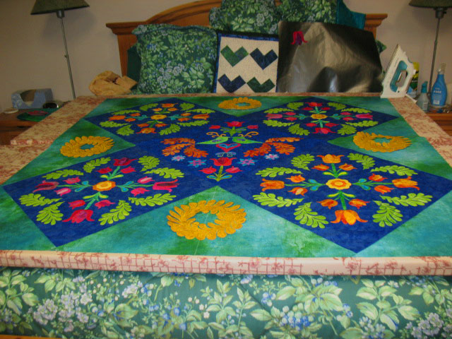
Sometimes, you just have to make decisions if you want to move a project along, and that’s where I was last weekend with my tulip quilt. I am always caught in this cycle of travel, and because I only have a big fusing surface in NC, I needed to get the setting triangles attached and to figure out the applique designs for those triangles before I left for OH. Here’s the quilt with the setting triangles attached:
You’re going to have to trust me here when I say that the colors here are not true. The setting triangle fabric is much darker than it appears and it also reads much more as a green than a blue. I laid it out on my “fusing bed” and started laying some appliques on it to get a sense of what to do. I wasn’t wild about this first idea:
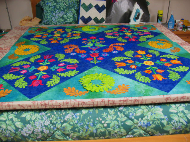
This bed is right by my Nordic track, so I like to gaze over what I’m working on as I’m getting a workout, and I kept jumping off the Nordic Track to swap out appliques! I first changed the wreaths so every other wreath was green and I added a splay of feathers to each base:
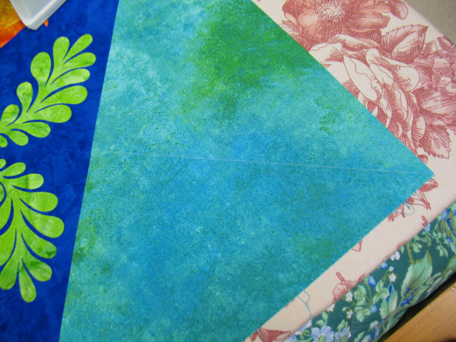
I had also drawn a soap line through the center of each corner setting triangle:
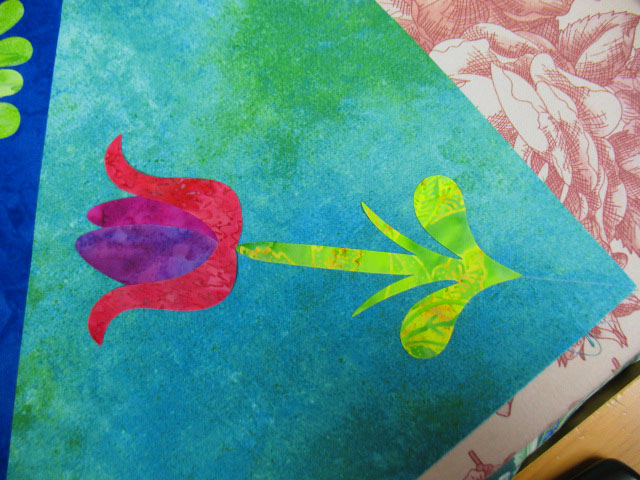
That line is a registration line…I placed a stem that was centered right on it, then added a tulip on top of the stem:
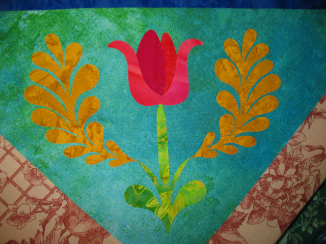
…and once those structures were fused into place, I added a pair of feathers to each corner:
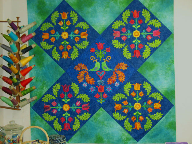
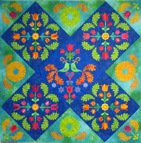
This brings me to where this project stood when I left NC…here it is on my design wall:
I like that the corner designs are quieter and subservient to the block designs, but I’m feeling twinges of regret that I opted for such subdued contrast between the corner appliques and the background fabric colors. Overall, I’m still loving this quilt, so I’m trying to squash down my doubts. I’m keeping my fingers crossed on this one!


very very pretty.:-)
My two cents….if you had chosen brighter colors they would have taken away from the center design and the energy there. The outside supports the inside….so it looks balanced to me.
Smiles,
Kelly
Drooling. Need to get a bib cloth. I’m in love. This is a spectacular quilt and I hope you enter it in some shows. I’ve always been in love with these applique’ designs, but even more so seeing the variety of what you create with it. This one is going to be an award winning quilt. Love it!
SewCalGal
http://www.sewcalgal.blogspot.com
It’s wonderful!!!!!!!….as always.
I love the quilt. I think you can increase the contrast in the corners by the colors of quilting thread.
So beautiful. I like that you let the center designs take precedence. They compliment rather than take over.
I think the quilt is just beautiful. I really love the colors you chose.
Overall I quite like it. The lighter colors of the applique allow the eyes to focus on the centre design. I wonder if it would look less “busy” if you were to quilt the same design in the setting triangles instead of applique.
oh my, that is so lovely!!! Can I have it please? 😉 And by the way, I have a nordic track (the old ski machine model) and I hate it! lol! Have a happy week my wonderful mentor!!!!
I love it! The colors are gorgeous on my screen and the additional appliques bring it all together. I really enjoy seeing what your create as you create it.
Debbie
This as absolutely breathtaking, love it
Love your progress on this design! Thanks for sharing with us. I like one of the previous comments re quilting the design in the setting triangles. I wonder if a softer shade of gold might settle in better with the other colors of your setting triangles (of course it may just be my monitor!). The softer green on the other setting triangles blends very nicely with the rest of your gorgeous design. Looking forward to seeing your finished quilt!
This quilt is just amazing! From a novice’s point of view, I’d say the green wreaths blend in with the background. The green pops out beautiful on the dark blue, but not as much on the background fabric. I’m sure it will look just perfect after the quilting is done. I like how the tulip heads point toward the center of the quilt.
Your beautiful quilting will ” Bring it home” as the saying goes.
Dorothy